
Our #UNSAMEYOURHOME Gallery: Part 3
For our third instalment, we shine the spotlight on some amazing rooms that feature our Artisan Effect paints. This collection provides outstanding, bespoke results that really enable you to create a unique home.
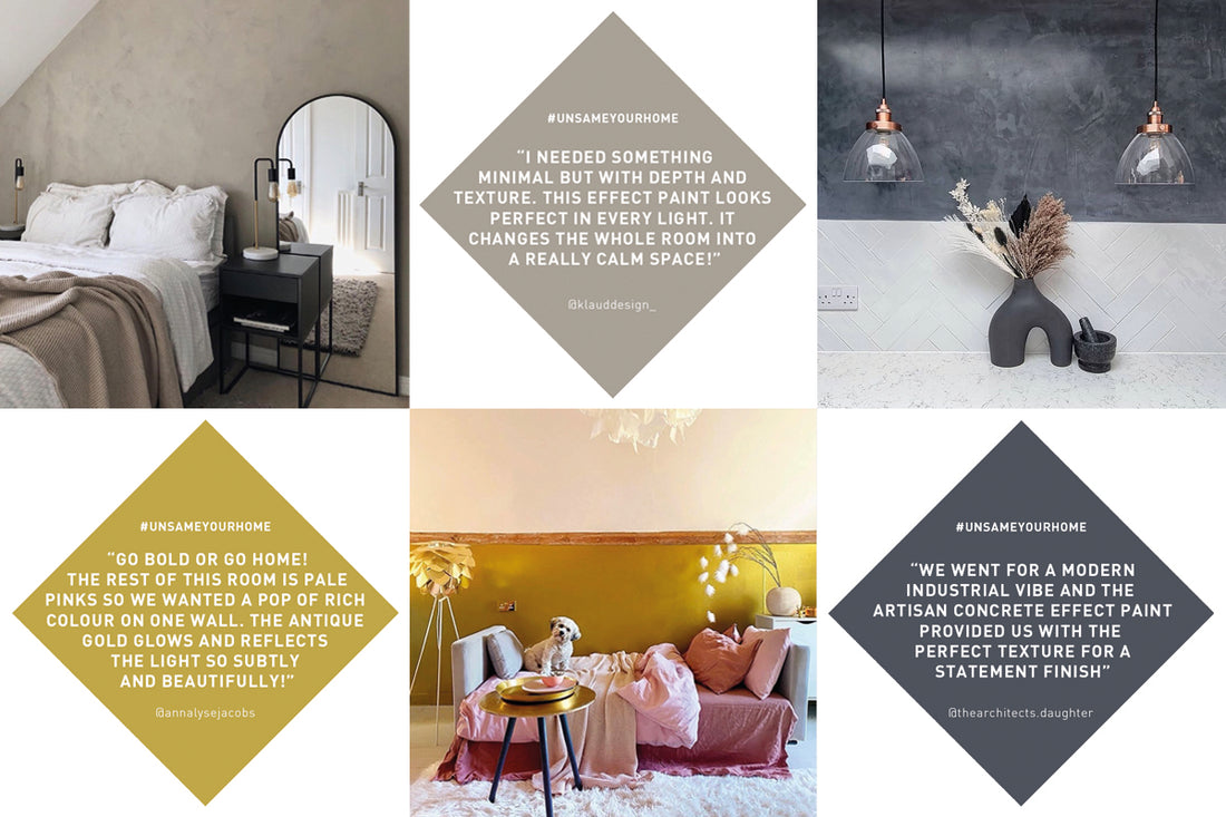
May '21
The bespoke nature of our Artisan Special Effects range allows you to create really unique features within your home. This concept, and the stunning finishes available are the ultimate option for you as you look to #UNSAMEYOURHOME. From sleek, contemporary Concrete Effect to the beautifully tactile texture of Stone Effect, you'll be amazed by what can be achieved. Here are just a few of our favourite real-home examples.
ARTISAN STONE, GOLD AND CHALK WASH EFFECTS
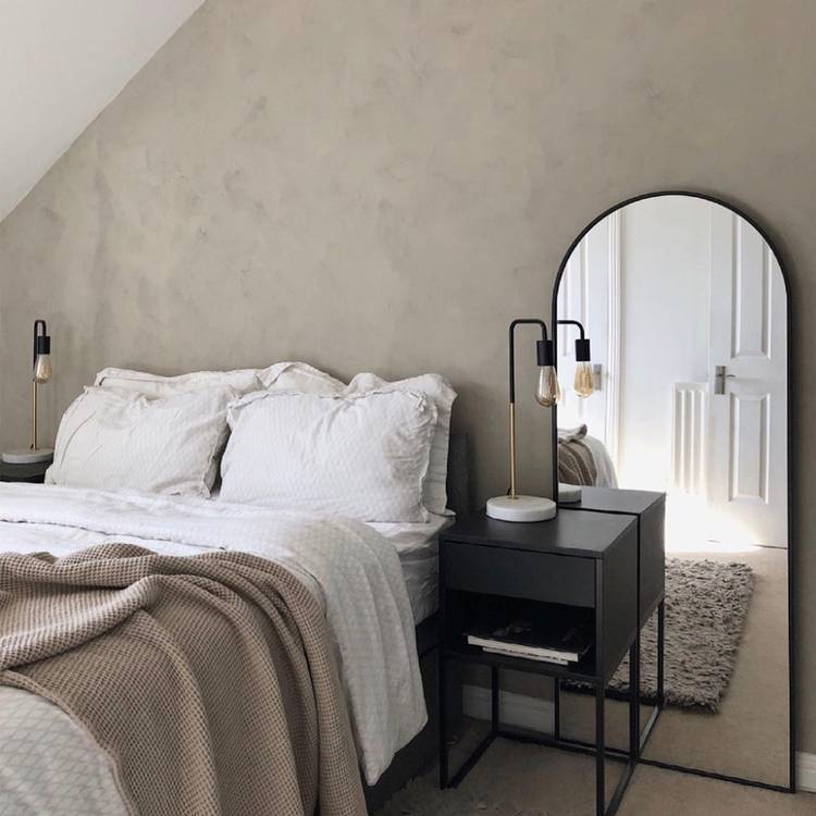
With the interiors trend for tonal neutrals and natural textures in full swing, Artisan Stone Effect is really having quite a moment. It's the perfect backdrop against minimal style accessories and varying tones of caramel through to warm grey. The textured surface of this water-based finish is available in three colours and effectively replicates the matt, earthy feel of weathered natural stone. Klaudia @klauddesign_ created this relaxed, Scandi-inspired style and we love how the texture of the wall is enhanced by the use of striking black details.
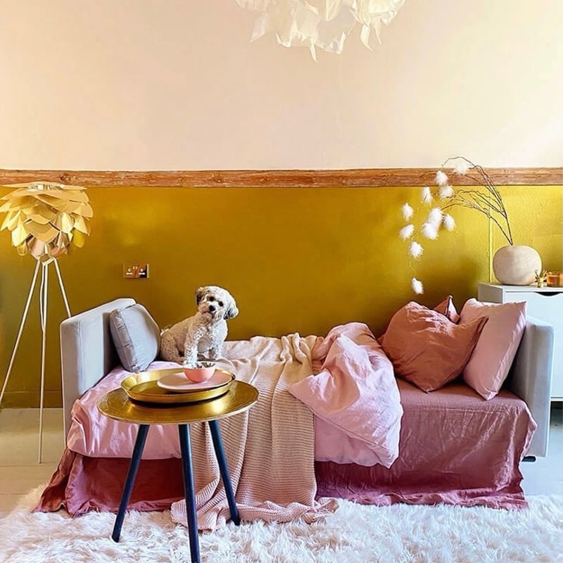
There's just something incredibly powerful about the use of gold in interiors and when it comes to a broad wall application such as this, the effect is quite breath-taking. Never one to be afraid of punchy colours and patterns, Anna @annalysejacobs decided to up the ante when it came to her daughter Coco's room. Artisan Antique Gold Effect paint was used across the lower half of this wall and was the perfect contrast to the subtle pink tones of the room.There's just something incredibly powerful about the use of gold in interiors and when it comes to a broad wall application such as this, the effect is quite breath-taking. Never one to be afraid of punchy colours and patterns, Anna @annalysejacobs decided to up the ante when it came to her daughter Coco's room. Artisan Antique Gold Effect paint was used across the lower half of this wall and was the perfect contrast to the subtle pink tones of the room.There's just something incredibly powerful about the use of gold in interiors and when it comes to a broad wall application such as this, the effect is quite breath-taking. Never one to be afraid of punchy colours and patterns, Anna @annalysejacobs decided to up the ante when it came to her daughter Coco's room. Artisan Antique Gold Effect paint was used across the lower half of this wall and was the perfect contrast to the subtle pink tones of the room.There's just something incredibly powerful about the use of gold in interiors and when it comes to a broad wall application such as this, the effect is quite breath-taking. Never one to be afraid of punchy colours and patterns, Anna @annalysejacobs decided to up the ante when it came to her daughter Coco's room. Artisan Antique Gold Effect paint was used across the lower half of this wall and was the perfect contrast to the subtle pink tones of the room.
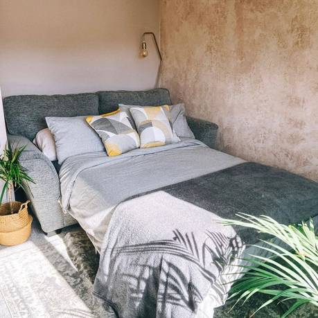
At the start of the pandemic in 2020, Emily @emshomestyle moved into her new home as a solo buyer and was eager to make her mark on the blank canvas. The start of this journey began with a virtual colour consultation with one of our in-house experts. This session helped Emily select some calming pink hues and textures for her spare room which was to become a multi-functional space complete with home office. Artisan Chalk Wash in Pink Clay was used over a base coat of Fresh Plaster to create this unique feature with the opposite wall in delicate Bohemia.

-
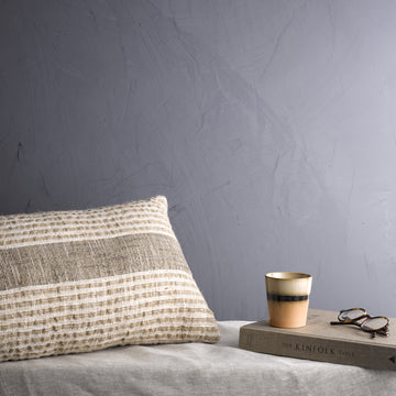
Onyx Edge Concrete Effect
All Paint Colours
-
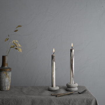
Pale Elements Concrete Effect
Artisan Paint Special Effects
-
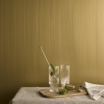
Antique Gold Effect
All Paint Colours
-
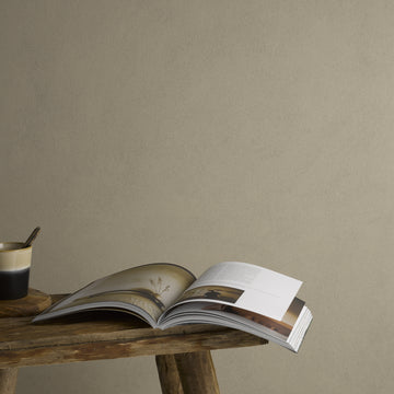
European Stone
All Paint Colours
-
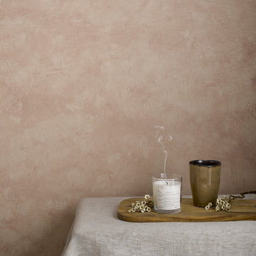
Pink Clay Chalk Wash
Artisan Paint Special Effects
ARTISAN CONCRETE EFFECT
Our Artisan Concrete Effect paint is a bit of a show-stopper, imitating the distinct characteristics of concrete surfaces. Fliss @thearchitects.daughter made the decision to opt for this choice in her kitchen explaining "We went for a modern, industrial vibe and the concrete effect paint provided us with the perfect texture for a statement finish". Available in two colours, Onyx Edge and Pale Elements, Fliss and her husband chose to mix the two and even added a higher level of smooth sheen by using an electric polisher at the final stage.

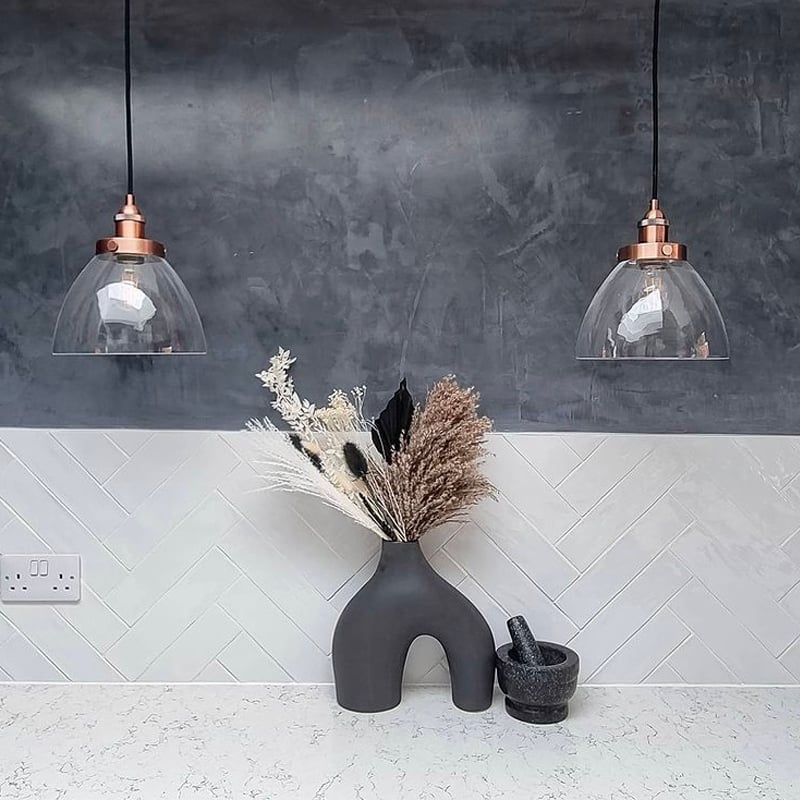

Onyx Edge Concrete Effect
All Paint Colours
There is a particular kind of joy in taking a room you see every day and making it feel entirely new. It is a feeling that sits at the heart of our Colour Forecast 2026, and one we wanted to explore through a real transformation.
For this bathroom project, we partnered with Matt Hatt, whose playful, hands-on approach captures the pleasure of decorating from first idea to final reveal. Known for his theatrical touch and his instinct for pairings that are daring yet considered, Matt brings real warmth and personality to everything he touches.
His brief was one many will recognise: to bring personality and cohesion to a main bathroom that, while structurally sound with its subway tiles, black grout and classic fittings, felt out of step with the rest of his Victorian home. The space called for a palette that could honour its period character while introducing something confident and true to himself.
From the four curated palettes within Colour Forecast 2026, Matt was drawn to Timeless, a collection that pairs the elegance of heritage tones with the boldness to reinvent a room, grounded throughout by warm, enveloping neutrals
A Lifelong Love of Transformation
Ever since I was young I've enjoyed transforming the environment around me. I was one of those kids that would go up to my room, and spend all day, on my own, listening to music trying out new combinations before inviting my mum in for a 'Changing Room' style reveal. Always had a flair for the dramatics.
That feeling of making something you see everyday feel completely new has stayed with me, through the many flats I've rented over the years, to my first home that I bought 3 years ago with my boyfriend. Playing with colour and pattern and leaning into the joy of decorating.
Expert Knowledge, Distilled
As a self-taught interior 'creator', I'm always looking for tricks or expert knowledge that I can use in my transformations. Craig and Rose's Colour Forecast is just that, the brand's expert knowledge distilled down into 4 feelings you want and need your room to be in 2026.
The Room That Needed Warmth
Our main bathroom had been on my to do list for a while, the core of it was good, subway style tiles with black grout, a giant fitted bathroom cupboard, a classic white sink, but it lacked warmth, felt out of kilter with the rest of the house.


Why Timeless Stood Out
The Timeless immediately stood out, as they felt to me like they combined the elegance of colours that would suit my Victorian home with the boldness to create a whole new look, and the warmth through the neutrals I was craving.
Knowing that Craig and Rose had done all the hard work for me, and that any combination of beautiful colours from the palette would work helped me to be so decisive when choosing my colours.
Making It My Own
It left me more time to add some creativity into application, and use of colour. Paint is a hugely powerful way to change a space entirely, and by using some decorating tape and following the steps of the useful guide on painting the perfect stripes I now have the bathroom my Victorian home deserves. (Painting Perfect Stripes: A Step-by-Step Guide by Craig & Rose) I have achieved a real stand out space that makes me smile everyday. I adore the warmth of Mallord on the walls and ceiling, Papyrus and Oriental Red on the bath and cabinets, and pops of the energising Smalt on skirtings.
Looking Back
I think 12-year old Matt would be quite chuffed with how far we've come in our transformation skills.
Matt Hatt


The Bathroom a Victorian Home Deserves
With the hard work of colour selection already done, Matt was free to focus on the details that make a space personal, using decorating tape and a steady hand to bring striking painted stripes to life. The result is a bathroom that feels warm, characterful and entirely his own, from the depth of Mallord on the walls and ceiling to the pops of energising Smalt along the skirtings. It is a fitting reminder that, with the right palette to guide the way, a considered transformation can be as enjoyable to create as it is to live with.
His brief was one many will recognise: to bring personality and cohesion to a main bathroom that, while structurally sound with its subway tiles, black grout and classic fittings, felt out of step with the rest of his Victorian home. The space called for a palette that could honour its period character while introducing something confident and true to himself.
From the four curated palettes within Colour Forecast 2026, Matt was drawn to Timeless, a collection that pairs the elegance of heritage tones with the boldness to reinvent a room, grounded throughout by warm, enveloping neutrals
Similar stories to explore


- Choosing a selection results in a full page refresh.
- Opens in a new window.