White Done Right: A guide to navigating Craig & Rose’s whites
White is anything but simple and we understand that selecting the perfect white is an art form. Our curated collection of whites — crafted with undertones to harmonise with light, space, and style, our collection offers endless versatility.
Feb '25
White is anything but simple.
At Craig & Rose, where rich heritage meets modern design, we understand that selecting the perfect white is an art form. Our curated collection of whites — crafted with undertones to harmonise with light, space, and style, our collection offers endless versatility. Whether crafting a serene sanctuary or a bold architectural statement, discover how our whites adapt effortlessly in your home.
The Foundation: Harmonising Undertones
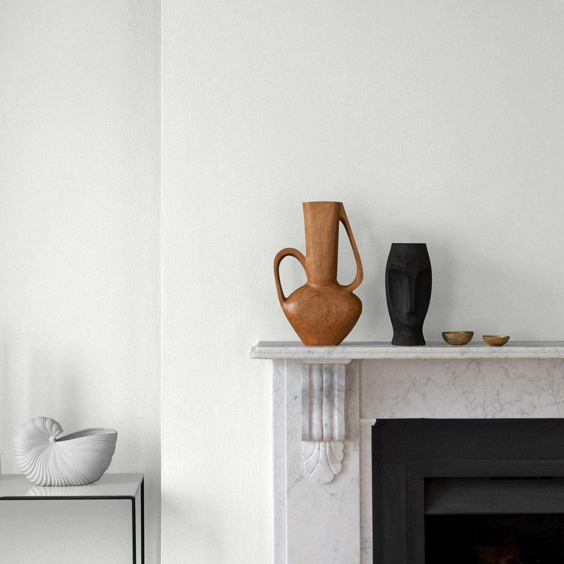
White is a chameleon. Its subtle it’s nuances — the whisper of cool blue, the hint of a golden cream, or the quiet neutrality that lets another colour’s sing. These undertones are the invisible curators of mood, shaping a room’s atmosphere long after the paint dries.

Step 1: Identify your room’s existing elements:
- Flooring: Is your oak floor oiled by honeyed patina (warm) or does your polished concrete lean cool with grey undertones?
- Furniture: A mid-century teak sideboard radiates warmth, while a steel framed sofa portrays cool modernity.
- Fixed Finishes: Marble countertops with veining? Note if they’re icy Carrara (cool) or a creamy calacatta (warm).
The Golden Rule:
At Craig & Rose, precision in undertones transforms spaces into cohesive narratives. Consider your room’s existing elements as characters in a story—each must complement the other.
Warm wood panelling? Pair with Regency White (antique ivory) Chalky Emulsion on walls—its honeyed undertones echo aged timber, creating a dialogue between heritage and warmth. Cool grey sofa? Frame it with Dutch White (balanced grey white) Eggshell on skirting boards, where the paint’s subtle grey-blue undertone sharpens modernity without sterility. But tread carefully: a cool grey carpet paired with Pale Mortlake Cream gloss woodwork (golden undertones) creates visual discord. The clash of warm and cool here draws attention to imbalance rather than intention.
Step 2: Break the Rules (Strategically)
If you crave contrast, intentionally mix undertones, then bridge the gap with art, textiles, or decor in complementary shades.
Warm Isabelline walls against cool steel shelving? Introduce linen cushions in Dutch White (balanced grey) to mediate. Cool Pantry White trim in a warm room? Add artwork with slate blue frames to echo the undertone.
Pro Tip: The Art of Testing – Beyond the Swatch
Light paints in dualities. A white that whispers at sunrise might shout contrast under artificial lighting.
Use a Moveable Canvas:
Whether a Sample Patch or painting a large swatch of your chosen white (Chalky White or Regency White) with a sample pot onto lining paper. This portable canvas lets you track how light shapes the colour.
Observe Its Dialogue with Light:
- Morning: Pin the swatch to a sunlit wall – does Broken White glow like fresh cream, or does Dutch White sharpen into a steely coolness?
- Afternoon: Move it to shaded corners. East-Facing rooms might mute warmth, as the sun moves, turning Isabelline from honeyed to hushed.
- Night: Test under artificial lighting. Does Whiting morph into a buttery gold under warm bulbs, clashing with cool tiled floors?
- Timing is everything! If the room is used mostly in the evening (e.g the dining room), prioritise how the white behaves at that hour.
Designer Insight: In north-facing rooms, blues and greys intensify. If Iona White appears glacial at midday but softens to serene stone at dusk, it’s a keeper—perfect for a snug where evening ambiance matters most
Embrace the journey! White is more than a colour – it’s a conversation between colour and light. Craig & Rose whites are crafted with nuanced undertones made to harmonise with your home, offering timeless cohesion or bold contrast depending on your vision.
-
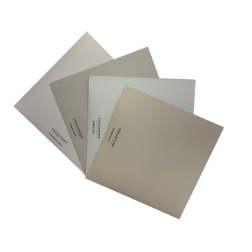
The Versatile Whites Colour Patches
1829 Vintage Collection
-

Marble Dust
1829 Vintage Collection
-

Regency White
1829 Vintage Collection
-

Dutch White
1829 Vintage Collection
-

Pale Mortlake Cream
1829 Vintage Collection
-

Craftsman' s White
1829 Vintage Collection
-

White Doe
1829 Vintage Collection
-
Pantry White
1829 Vintage Collection


Similar stories to explore


- Choosing a selection results in a full page refresh.
- Opens in a new window.