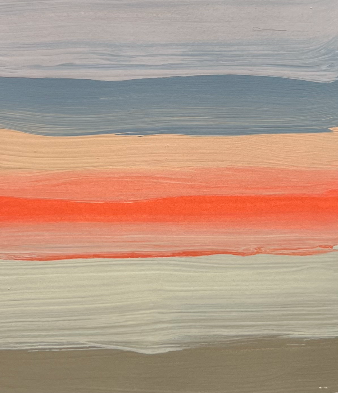
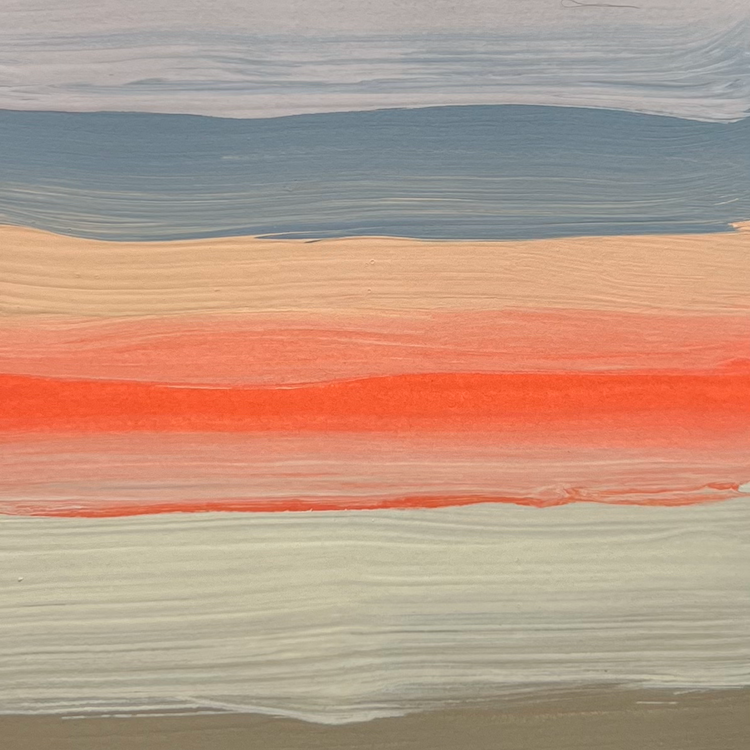
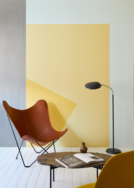
2024 Colour Forecast
Craig & Rose's 2024 Colour Forecast carefully selects the colours essential for the upcoming year. These colours complement various aspects of our lives, from providing stability when needed to nourishment when desired.
Feb '24
Craig & Rose's 2024 Colour Forecast carefully selects the colours essential for the upcoming year. These chosen colours complement various aspects of our lives, from providing stability when needed to nourishment when desired. We recognise the importance of aligning with our emotional needs and how colour has the ability to support us during this time.
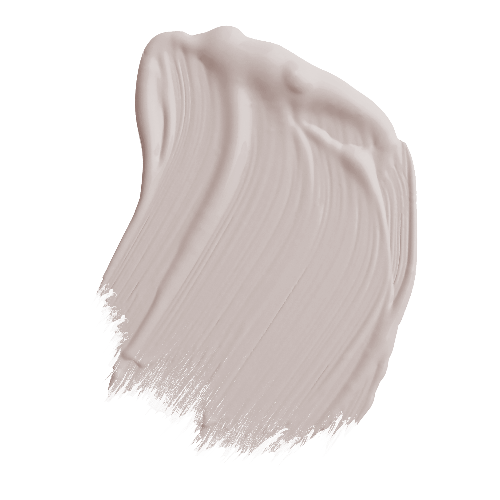
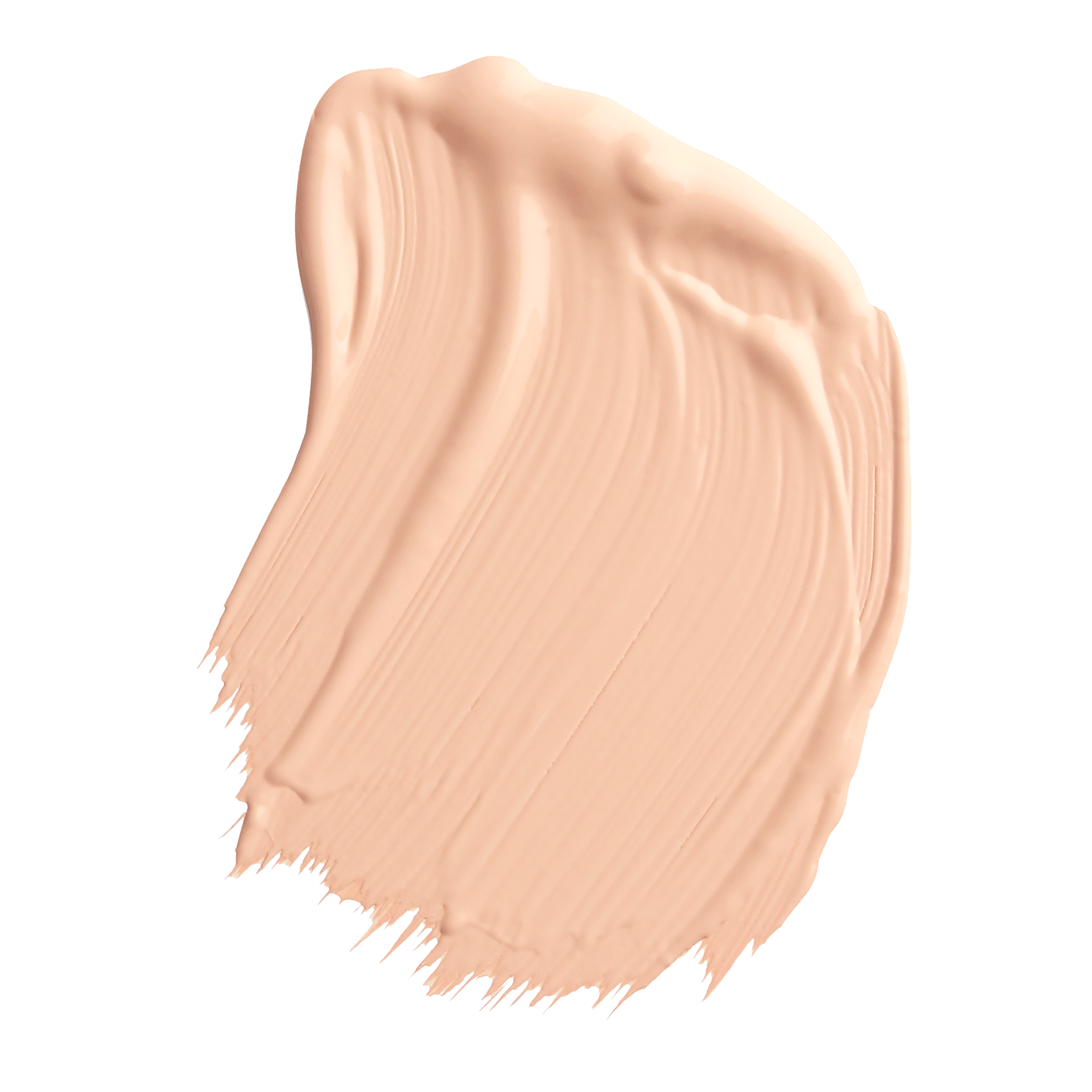
LADY EMMA
Lady Emma transforms into a visual symphony when bathed in light, unveiling delicate hints of lavender and sakura. The nuanced undertone sets a feeling of tranquillity and elegance.
This mauve hue transcends boundaries with its remarkable versatility, seamlessly weaving into varied lifestyles. In the warm embrace of traditional styles and homes, Lady Emma unfolds as a graceful and organic presence, effortlessly harmonising with country elements and nature-inspired decor. The muted yet captivating hues align with the cosy, nostalgic ambiance of traditional and country living.
On the other hand, Lady Emma gracefully adapts to the sleek lines of contemporary homes. Its muted sophistication adds a touch of softness, creating a balanced juxtaposition in modern settings. Here, Lady Emma maintains its allure, offering a bridge between the charm of tradition and the sleekness of modernity.

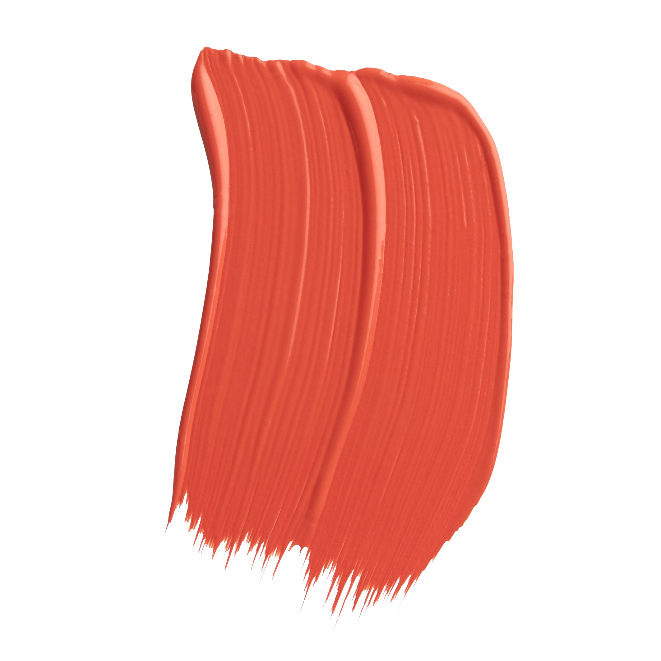
TROUBADOUR
This invigorating and uplifting colour resonates deeply with the pursuit of joy. Its rich saturation imparts an immersive experience, aligning itself with mindful living. The lively fiery red exudes a brightness that has the power to reignite your perspective and focus, injecting a burst of energy into your surroundings and daily experiences in your home.
Troubadour, with its coral undertone, effortlessly merges into vintage and maximalist styles, enhancing not only these aesthetics but also the lifestyle they convey. Surprisingly, it also complements traditional aesthetics showcasing its versatility in adapting to diverse design schemes and architectural details. Whether embracing the bold and eclectic elements of maximalism, the nostalgic charm of retro accessories, or the ornate architectural details of traditional properties.
Troubadour embodies main character energy, with its dynamic presence becomes more than a design choice; it becomes a lifestyle statement.

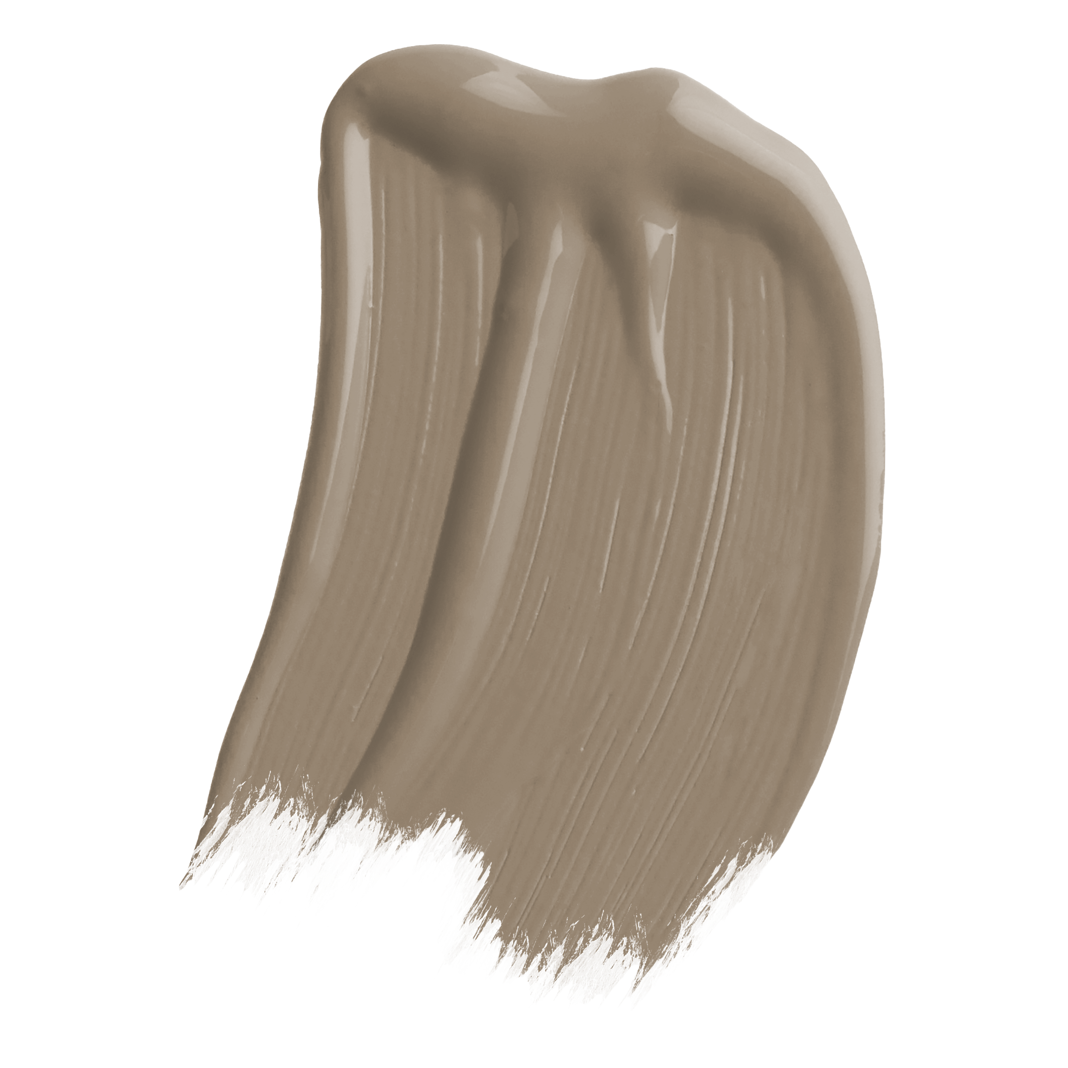
CHÂTELAINE
Châtelaine emanates a soothing radiance, and its gentle, sun-kissed quality corresponding with the principles of self-care and nourishment. The charm of Châtelaine lies in its ability to create an atmosphere of comfort and vitality. This colour is thoughtfully curated to provide a source of replenishment for the mind, body, and soul to wherever it’s applied.
This hue is effortlessly laid-back, especially when paired with neutrals and earthy materials, feeling reminiscent to a summer’s day. Whether it’s the casual warmth of a bohemian space or a mid-century throwback of a bygone era, Châtelaine adds a timeless and comforting touch to any room, creating a space that feels both grounded and inviting.

LUCIENNE OLIVE
Lucienne Olive’s soothing presence conjures the imagery of a forest woodland in the final moments before dusk. The subdued hue of burnt sage takes on a transformative role, sculpting a space where the mind can gently unwind. This muted green becomes a sanctuary, offering a welcomed respite from overstimulation and providing authentic relief from the burdens of stress and anxiety.
In a contemporary context, Lucienne Olive aligns with the ritual of “saging,” the act of burning sage to purify spaces, rid them of negative energy, and promote healing and wisdom. Embraced across various home styles—ranging from modern and minimalist to farmhouse and cottagecore—it consistently complements both the clean, modern aesthetic to the rustic charm of aged patina materials. Lucienne Olive establishes a room’s ambiance as a dedicated space for contemplation and relaxation.

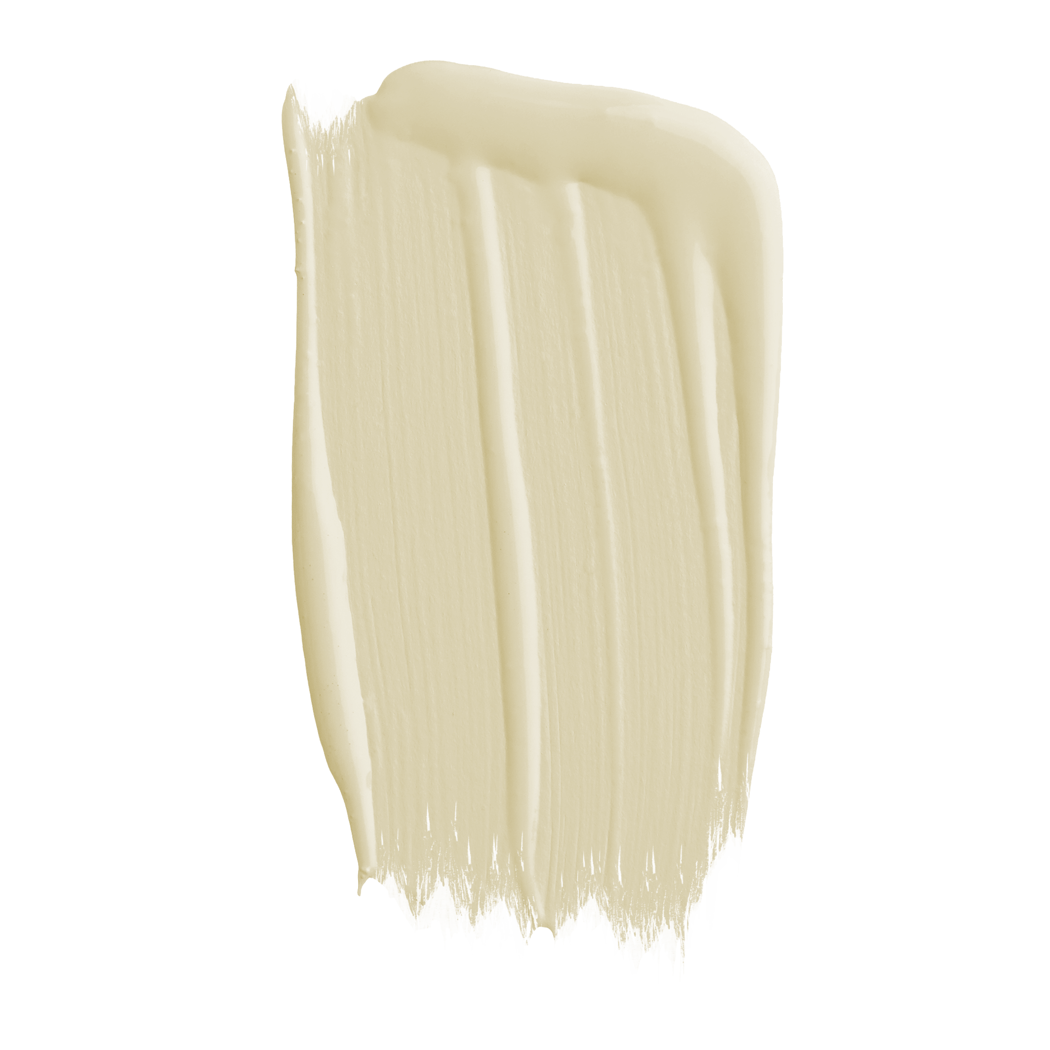
EAU DE NIL
Eau de Nil, an ethereal green not only serves as a soothing neutral but also carries restorative properties. It creates an ambiance that resonates with well-being. Its unique blend of delicate pale yellows and greens captures the fleeting beauty akin to its namesake.
The representation of water in Eau de Nil goes beyond; it underscores the therapeutic quality inherent in its essence. This shade has the power to induce a sense of calm, inviting a mental retreat and promoting relaxation within a space. It becomes more than a colour; it becomes a subtle yet impactful element in creating environments that echo serenity.
Eau de Nil’s versatility is another facet of its charm. Whether it’s the lush botanical haven, the nostalgic vibes of a vintage retreat, or the free-spirited allure of a bohemian studio, its lumionisity truly lights and restores the darkest of spaces.

STEEL POLE
Steel Pole emerges as sophisticated mid-tone blue, radiating a sense of stability. Beyond its steely appearance, it serves as an ideal backdrop for moments of reflection, creating a strong cohesion in many rooms. Its seamless integration into a variety of styles, ranging from coastal to industrial, highlights its adaptability and universal appeal.
This versatile colour goes beyond its standalone beauty; it effortlessly harmonises with a spectrum of other hues. This opens up possibilities for creative pairings, enabling individuals to experiment with combinations that suit their unique tastes. Whether paired with
artisan finishes for a bespoke touch or classic neutrals for timeless elegance, Steel Pole adapts to diverse preferences, enhancing the visual landscape with its refined presence.

SHOP CRAIG & ROSE'S 2024 FORECAST COLOURS

-
Lady Emma
1829 Vintage Collection
-
Troubadour
1829 Vintage Collection
-
Chatelaine
1829 Vintage Collection
-
Lucienne Olive
1829 Vintage Collection
-
Eau de Nil
1829 Vintage Collection
-

Steel Pole
1829 Vintage Collection
Similar stories to explore


- Choosing a selection results in a full page refresh.
- Opens in a new window.