
HOW TO CREATE TEXTURE WITH CHALK WASH
Incorporate the hottest trend in interiors by creating truly captivating texture in your home with Artisan Chalk Wash.
May '23
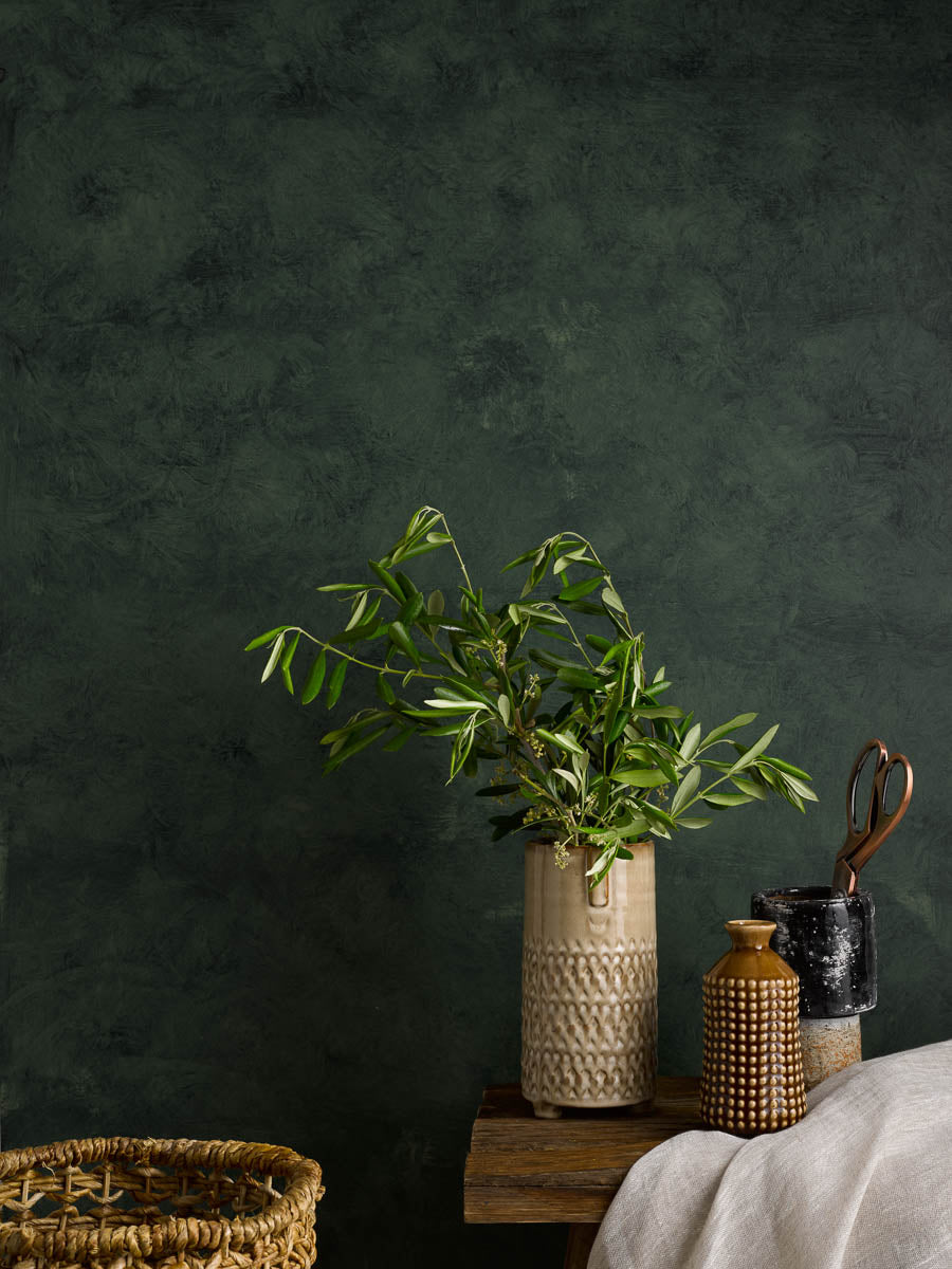
ENHANCED DEPTH
Texture has been one of the biggest trends in interiors for the last few years. Recently this love of tactile finishes has extended to our walls and this paint finish allows you to create the look of delicate broken colour with a subtle marble-like effect. It's a highly sympathetic look for properties with character, bringing further detail and visual delight. For contemporary interiors this effect paint will allow you to incorporate depth and intrigue to even the most simple surfaces which, once teamed with tactile materials and plentiful decor will be sure to charm every audience. There is currently four colour options in the Artisan Chalk Wash range:
- Blue Ochre
- Terre Vert
- Flax Yellow
- Pink Clay
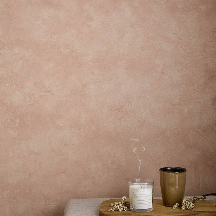
Warm with a gentle softness - Pink Clay Chalk Wash over a base coat of Broken White.
-
Pink Clay Chalk Wash
Artisan Paint Special Effects
-
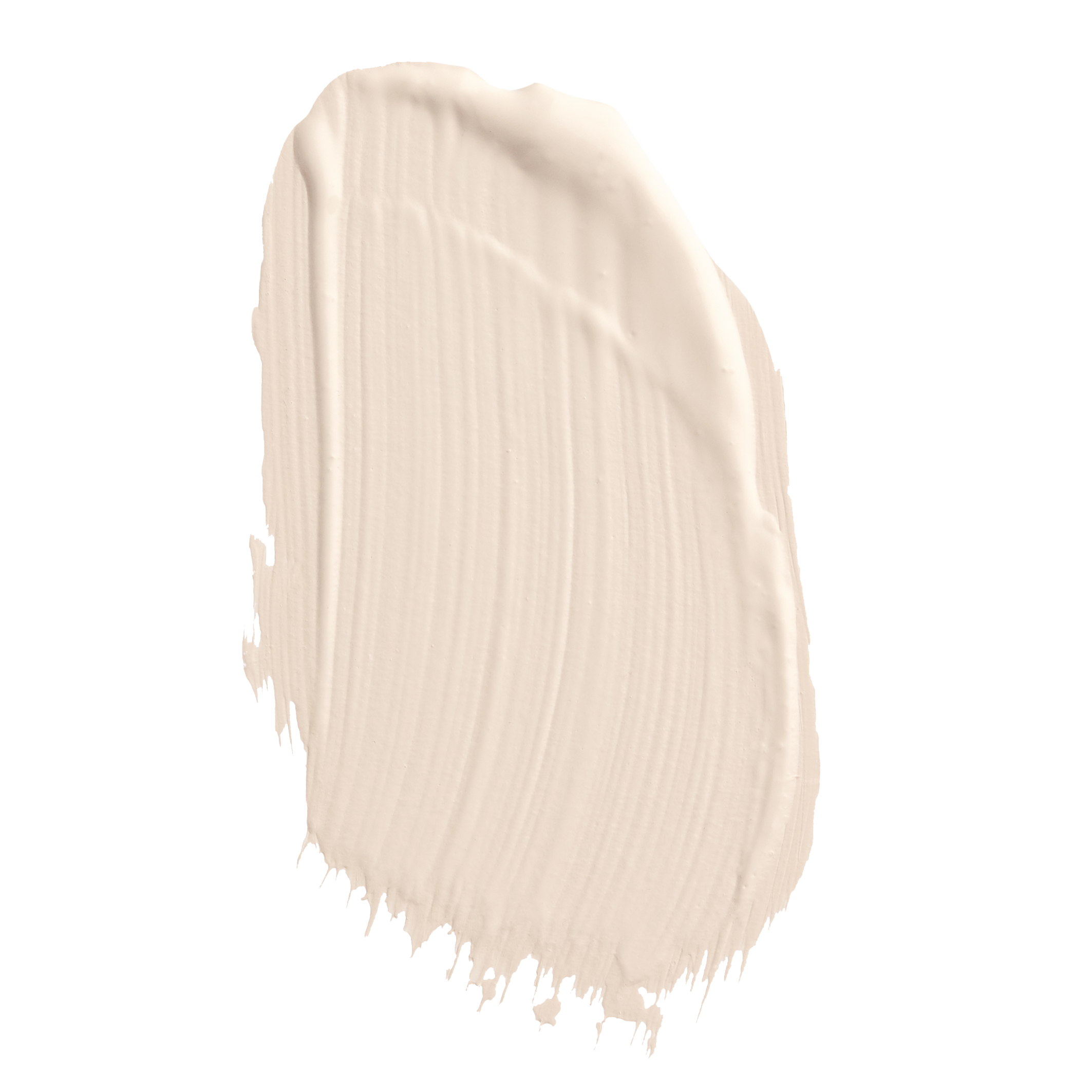
Broken White
1829 Vintage Collection
UNIQUE RESULTS
Elegant and timeless, Chalk Wash can be applied by sponge, rag or brush for a bespoke end result depending on the level of detail you want to create. To achieve this captivating texture, you'll need to apply over a base coat of Craig & Rose 1829 Chalky Emulsion. Choose an opposite colour for a bold effect or pair with a similar shade for a more understated look.
PREPARATION
- As with all of our Artisan paint effects, we suggest that you practice the application process on a separate board/s where possible to allow you to discover your preferred result. Try a few different application tools and see what suits your scheme best.
- Chalk Wash needs to be applied over a base coat of Craig & Rose 1829 Chalky Emulsion which has been painted at least 7 days prior.
- All surfaces must be thoroughly free of all dirt, dust, grease, loose or flaking paint.
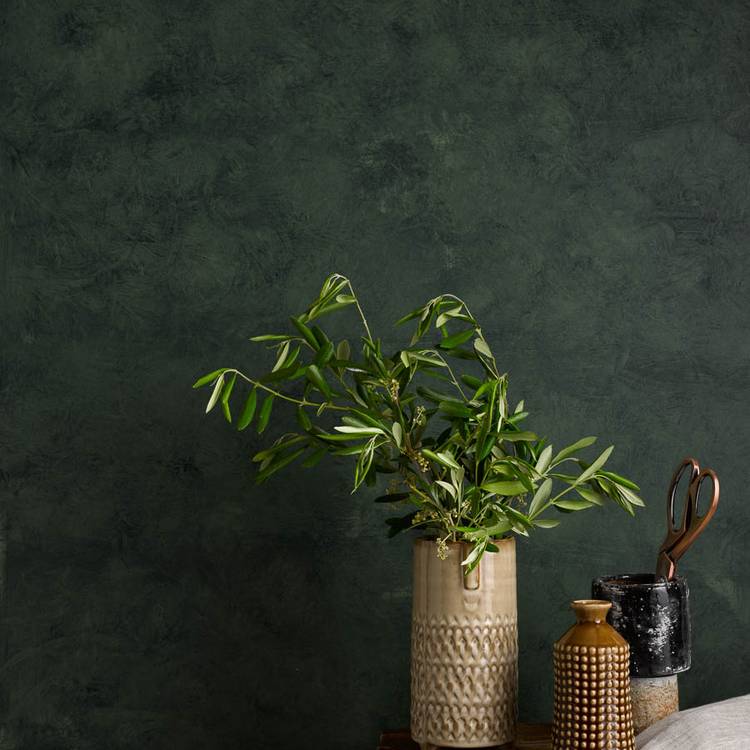
APPLICATION TOOLS
- A wide brush - high-quality and synthetic
- To create the textured effect you will need:
- Rags - clean, dry cotton rags – muslin rags are best
OR
- Sponge - sea sponge or synthetic household sponge, or sponge trowel
APPLICATION
- Starting at the top left-hand corner of the wall apply Chalk Wash using a wide brush (50-75mm) in a random pattern.
- It is important that good coverage is achieved and there are no areas where the product is not completely applied.
- Following closely after, create the desired pattern by ragging muslin cloth over the freshly painted Chalk Wash surface, turning the cloth in your hand to avoid a “stamped” pattern and to use dry areas of the cloth. Alternatively, use a sponge or sponge trowel.
- If you decide to use a muslin cloth, the method we recommend is not to hold the muslin on the surface and roll, but to use a large amount of scrunched muslin and “pounce” or press this quickly and repeatedly to the wall, absorbing the Chalk Wash and leaving a broken, subtle pattern of colour.
- Do not go back over completed work. Do not stop in the middle of a wall.
ADDITIONAL TIPS
For a softer, more subtle, aged look - just when the Chalk Wash is nearly dry, use a dry flogger brush to lightly brush in all directions, breaking up darker areas and creating a very subtle colour variation.
DRY TIME
- If necessary you can re-coat after 2-4 hours depending on conditions.
- You will achieve full paint hardness in 7 days.
- The temperature of the room must be above 10ºC during application and drying. Under cooler or more humid conditions, allow for longer drying time.
If you require further information, please read through our TECHNICAL DATA SHEET for Artisan Chalk Wash.
Have you used this product, loved it and want to inspire others? Tag us in on Social Media so we see!
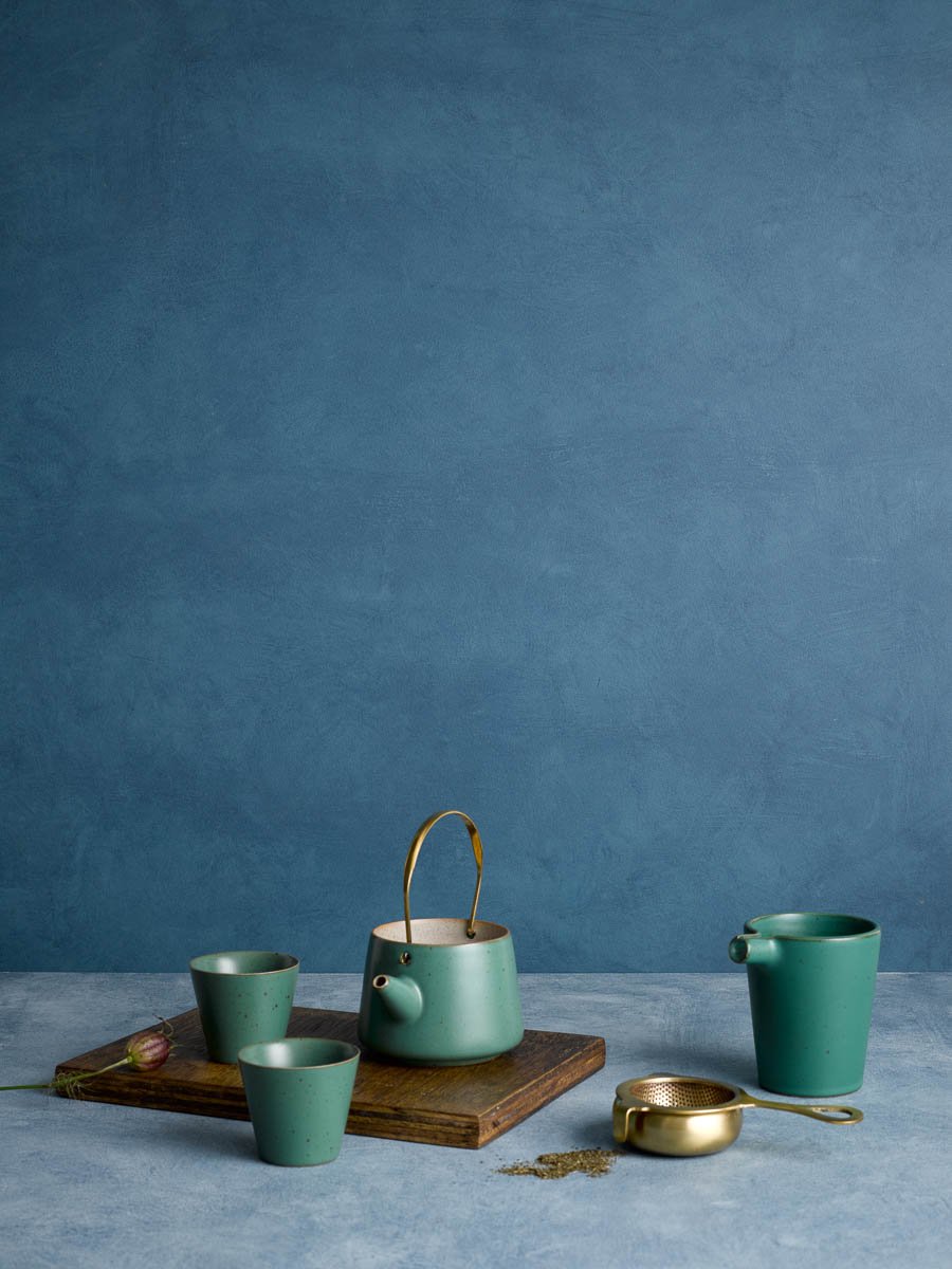
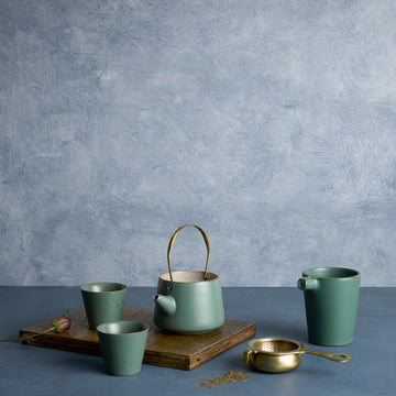
Blue Ochre Chalk Wash over a base coat of Saxe Blue Chalky Emulsion

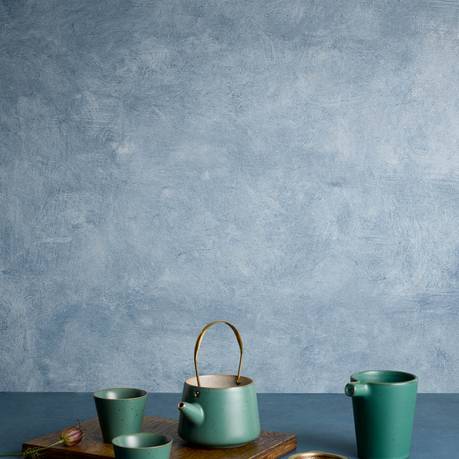
Blue Ochre Chalk Wash over a base coat of Pale Celadon Chalky Emulsion
-
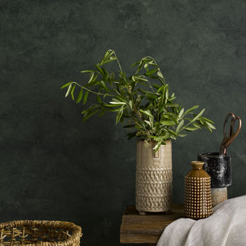
Terre Vert Chalk Wash
Artisan Paint Special Effects
-

Deep Adam Green
1829 Vintage Collection
-
Blue Ochre Chalk Wash
Artisan Paint Special Effects
-

Saxe Blue
1829 Vintage Collection
-
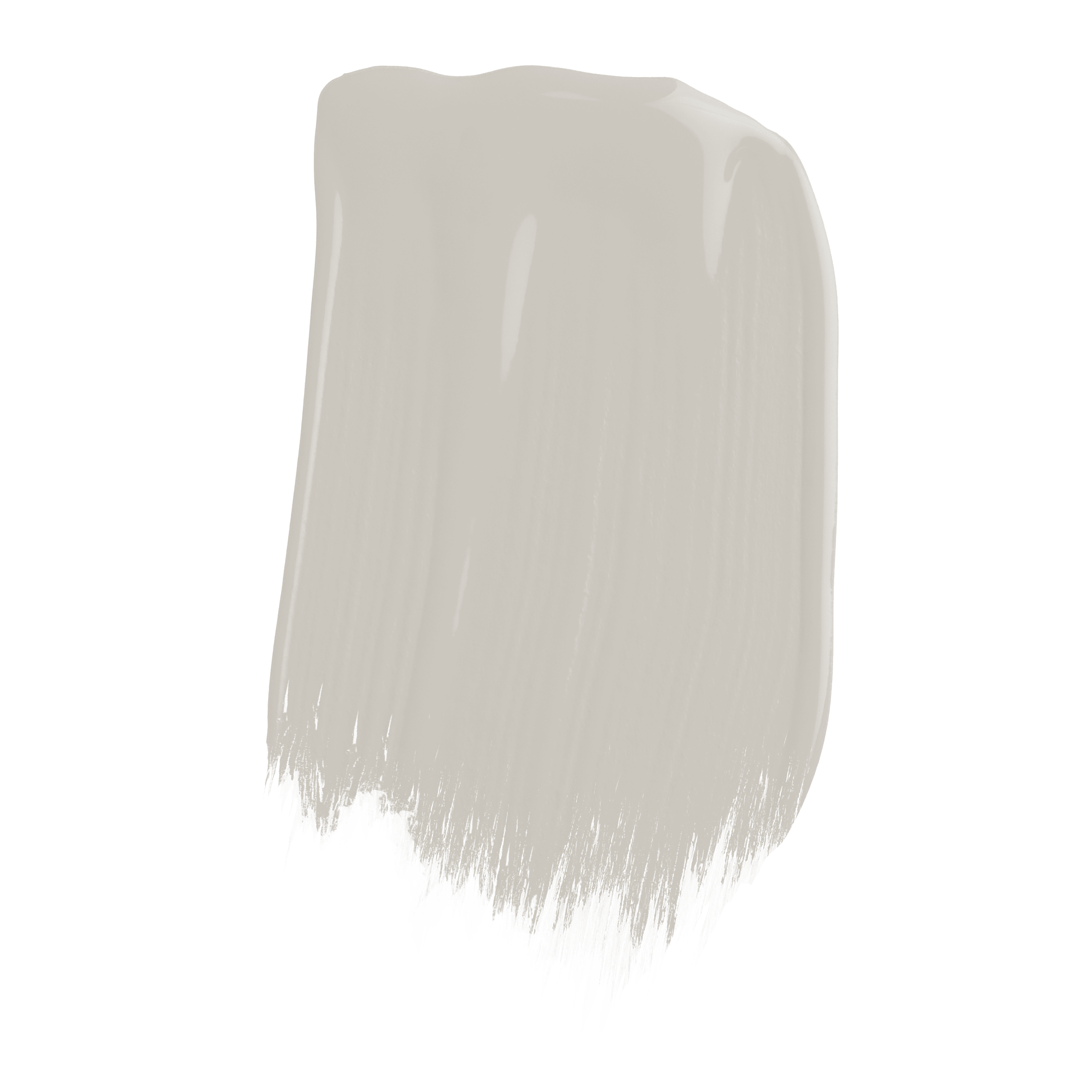
Pale Celadon
1829 Vintage Collection
-
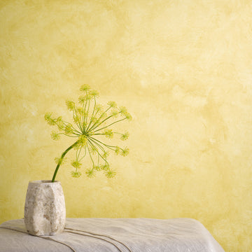
Flax Yellow Chalk Wash
Artisan Paint Special Effects
-
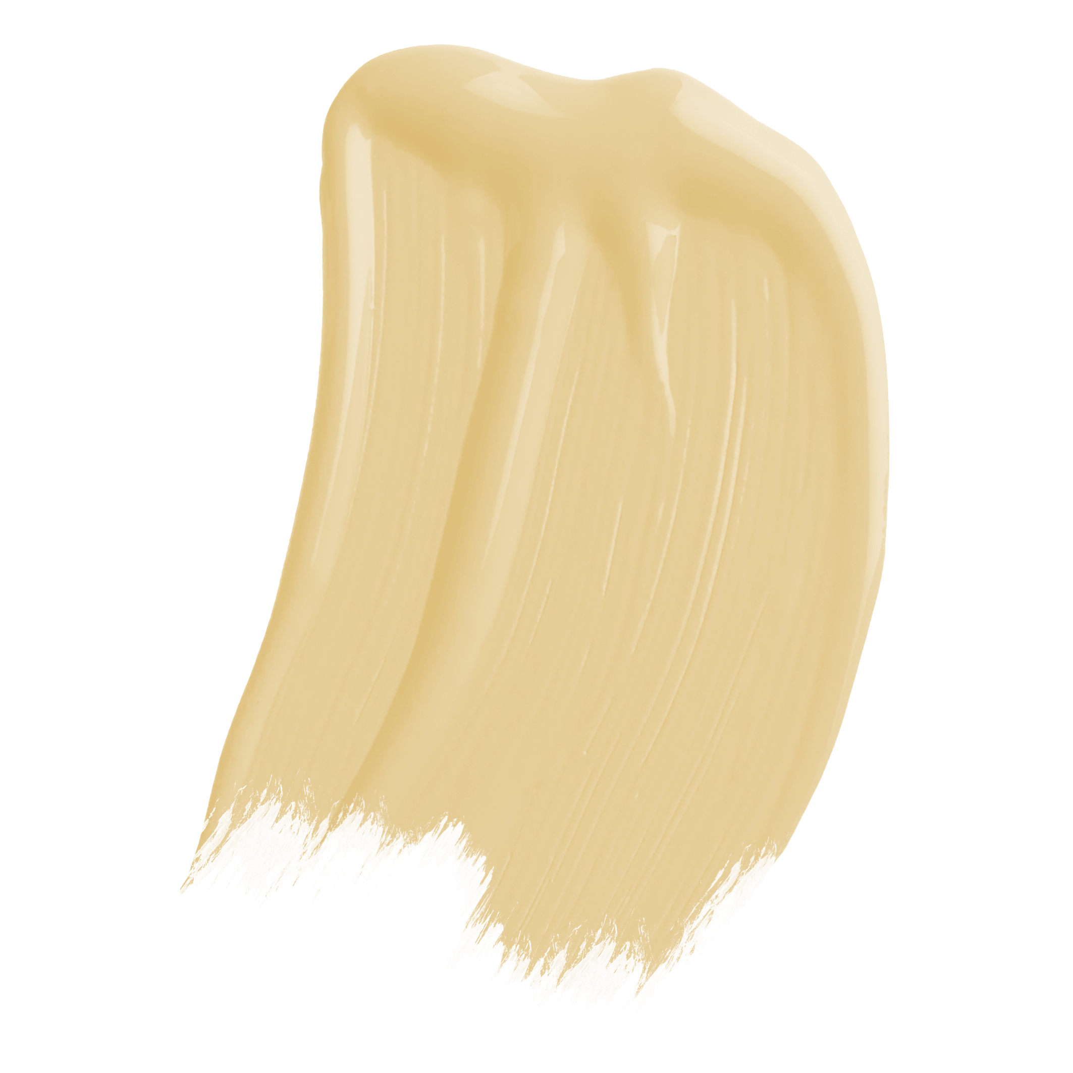
Moorish Yellow
1829 Vintage Collection
There is a particular kind of joy in taking a room you see every day and making it feel entirely new. It is a feeling that sits at the heart of our Colour Forecast 2026, and one we wanted to explore through a real transformation.
For this bathroom project, we partnered with Matt Hatt, whose playful, hands-on approach captures the pleasure of decorating from first idea to final reveal. Known for his theatrical touch and his instinct for pairings that are daring yet considered, Matt brings real warmth and personality to everything he touches.
His brief was one many will recognise: to bring personality and cohesion to a main bathroom that, while structurally sound with its subway tiles, black grout and classic fittings, felt out of step with the rest of his Victorian home. The space called for a palette that could honour its period character while introducing something confident and true to himself.
From the four curated palettes within Colour Forecast 2026, Matt was drawn to Timeless, a collection that pairs the elegance of heritage tones with the boldness to reinvent a room, grounded throughout by warm, enveloping neutrals
A Lifelong Love of Transformation
Ever since I was young I've enjoyed transforming the environment around me. I was one of those kids that would go up to my room, and spend all day, on my own, listening to music trying out new combinations before inviting my mum in for a 'Changing Room' style reveal. Always had a flair for the dramatics.
That feeling of making something you see everyday feel completely new has stayed with me, through the many flats I've rented over the years, to my first home that I bought 3 years ago with my boyfriend. Playing with colour and pattern and leaning into the joy of decorating.
Expert Knowledge, Distilled
As a self-taught interior 'creator', I'm always looking for tricks or expert knowledge that I can use in my transformations. Craig and Rose's Colour Forecast is just that, the brand's expert knowledge distilled down into 4 feelings you want and need your room to be in 2026.
The Room That Needed Warmth
Our main bathroom had been on my to do list for a while, the core of it was good, subway style tiles with black grout, a giant fitted bathroom cupboard, a classic white sink, but it lacked warmth, felt out of kilter with the rest of the house.


Why Timeless Stood Out
The Timeless immediately stood out, as they felt to me like they combined the elegance of colours that would suit my Victorian home with the boldness to create a whole new look, and the warmth through the neutrals I was craving.
Knowing that Craig and Rose had done all the hard work for me, and that any combination of beautiful colours from the palette would work helped me to be so decisive when choosing my colours.
Making It My Own
It left me more time to add some creativity into application, and use of colour. Paint is a hugely powerful way to change a space entirely, and by using some decorating tape and following the steps of the useful guide on painting the perfect stripes I now have the bathroom my Victorian home deserves. (Painting Perfect Stripes: A Step-by-Step Guide by Craig & Rose) I have achieved a real stand out space that makes me smile everyday. I adore the warmth of Mallord on the walls and ceiling, Papyrus and Oriental Red on the bath and cabinets, and pops of the energising Smalt on skirtings.
Looking Back
I think 12-year old Matt would be quite chuffed with how far we've come in our transformation skills.
Matt Hatt


The Bathroom a Victorian Home Deserves
With the hard work of colour selection already done, Matt was free to focus on the details that make a space personal, using decorating tape and a steady hand to bring striking painted stripes to life. The result is a bathroom that feels warm, characterful and entirely his own, from the depth of Mallord on the walls and ceiling to the pops of energising Smalt along the skirtings. It is a fitting reminder that, with the right palette to guide the way, a considered transformation can be as enjoyable to create as it is to live with.
His brief was one many will recognise: to bring personality and cohesion to a main bathroom that, while structurally sound with its subway tiles, black grout and classic fittings, felt out of step with the rest of his Victorian home. The space called for a palette that could honour its period character while introducing something confident and true to himself.
From the four curated palettes within Colour Forecast 2026, Matt was drawn to Timeless, a collection that pairs the elegance of heritage tones with the boldness to reinvent a room, grounded throughout by warm, enveloping neutrals
Similar stories to explore


- Choosing a selection results in a full page refresh.
- Opens in a new window.