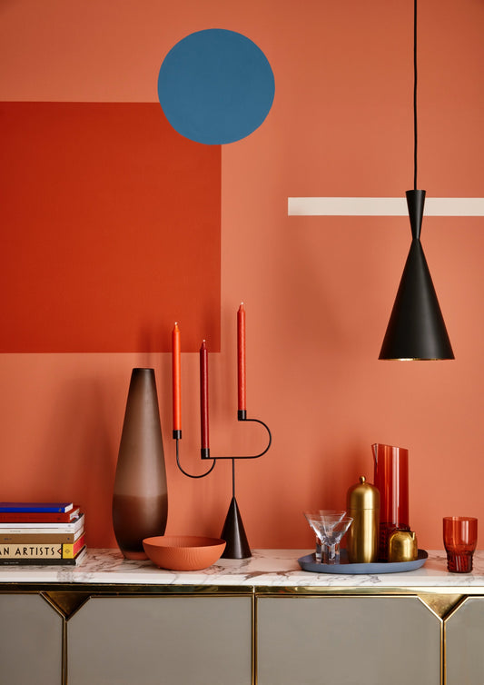
PINK AND GREEN SHOULD ALWAYS BE SEEN
As opposing shades on the colour wheel, these two familiar colours bring balance and harmony with green providing a sense of wellness and restful reassurance and the pink, some much-needed calm. Here are some great examples to inspire you to create a pink and green scheme in your own home.
Jul '20
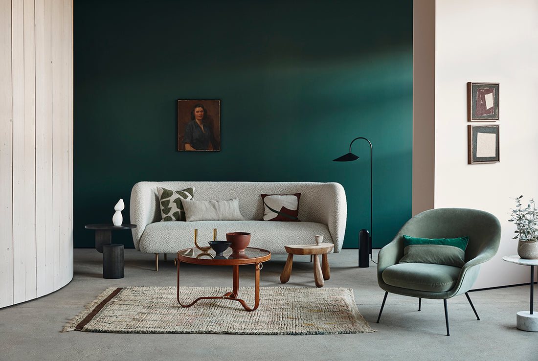
Incorporating cool greens into an interior scheme alongside tones of pink can immediately create a feeling of tranquility and peace. This particular pairing is one that has been used for centuries and yet each season is given an update through the use of new patterns, interesting materials and more recently the importance of incorporating plant life into interiors. When taking a look at a colour wheel, its easy to understand why this colour partnership works so well. As opposing shades, they bring balance and harmony with green providing a sense of wellness and restful reassurance and the pink, some much-needed calm. Here are some great examples to inspire you to to create a pink and green scheme in your own home.
DON'T MAKE ME BLUSH
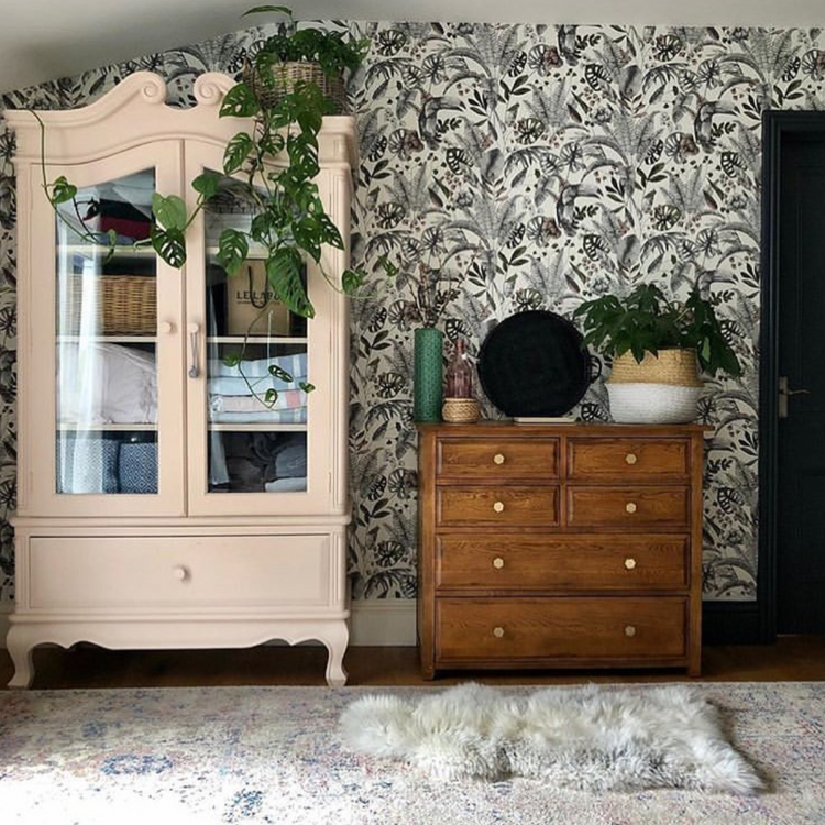
Below middle image features a detailed armoire painted in Fresh Plaster sits prettily next to this tropical green print and warm wood furniture. Image credit: @little.black.cabin
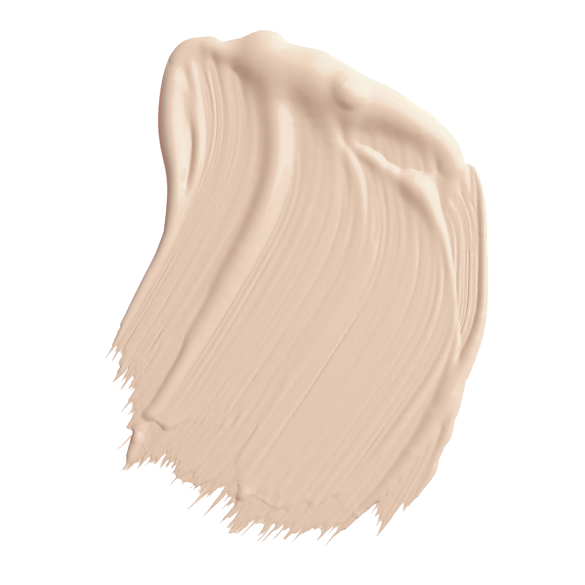
Inspired by the classic colour of freshly applied lime plaster, this shaded natural boasts a gentle warmth and the subtle pink tones make it the perfect colour to sit alongside powerful greens such as Ottilie and Angelica.
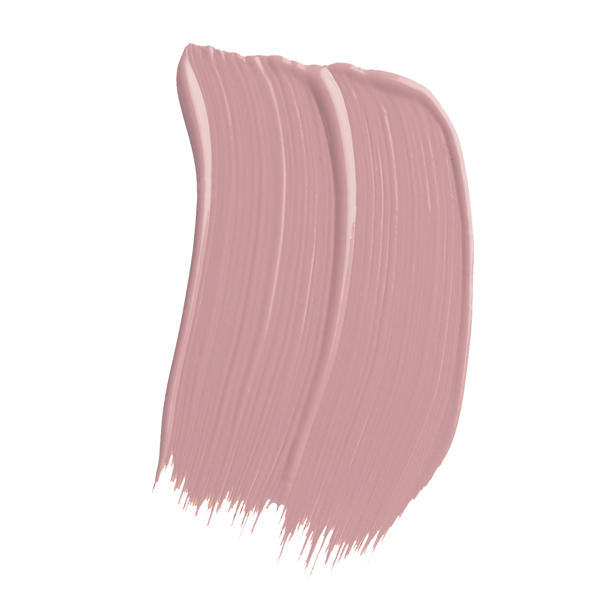
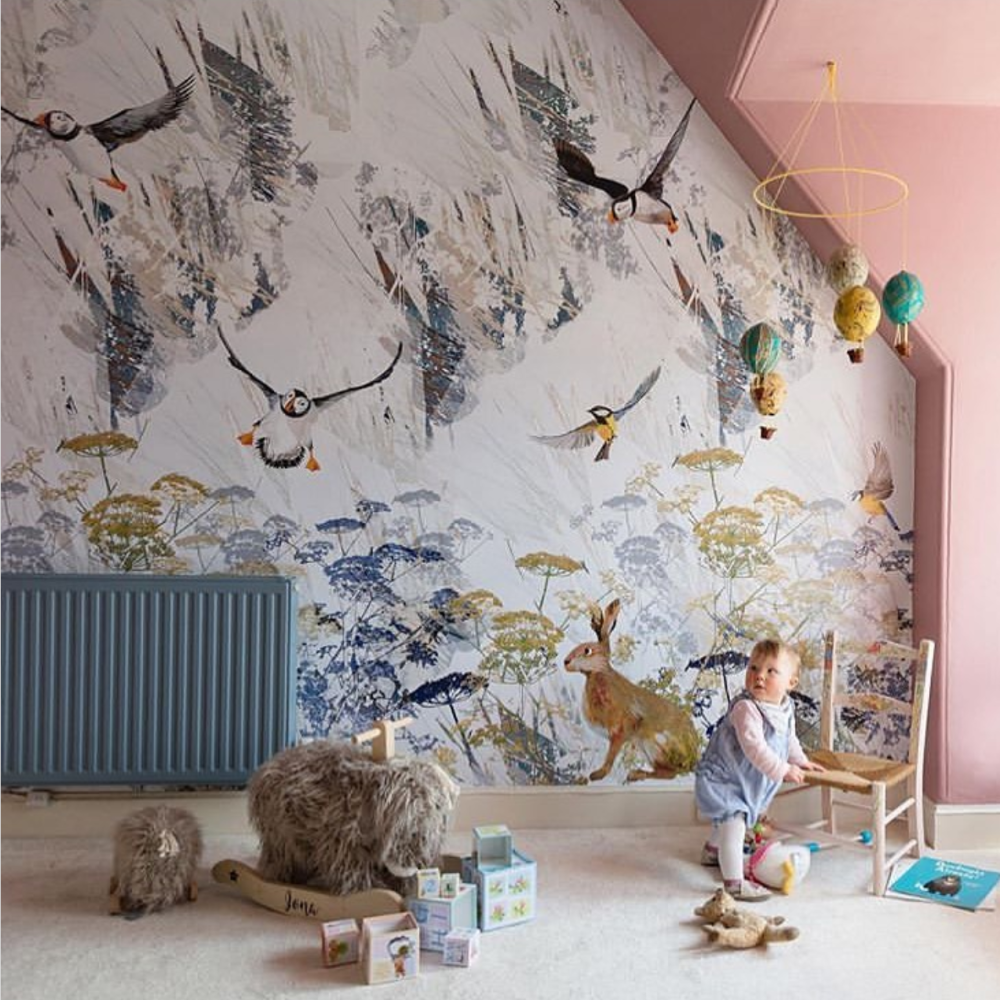
Below left image, Mairi Helena used Wedgwood Lilac on the walls and Steel Pole on the radiator of her daughters room.
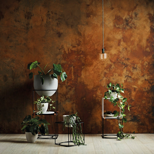
Another great way to pull both pink and green together in a room is to introduce little accents of greenery. Plants dotted throughout the room add a splash of luscious colour. Botanical references can also be incorporated in the form of pattern. Mairi Helena's wall mural entitled 'Ionas Animal World' features highlights of leafy green cow parsley stems which perfectly balance the soft pink tone of Wedgewood lilac on the walls of her daughter's nursery.
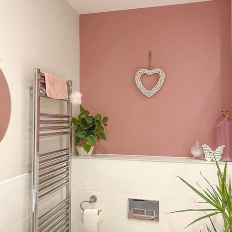
Bewlow right, plant accents alongside crisp white and Wedgwood Lilac. Image credit: @home_withroxie

A MATCH MADE IN HEAVEN
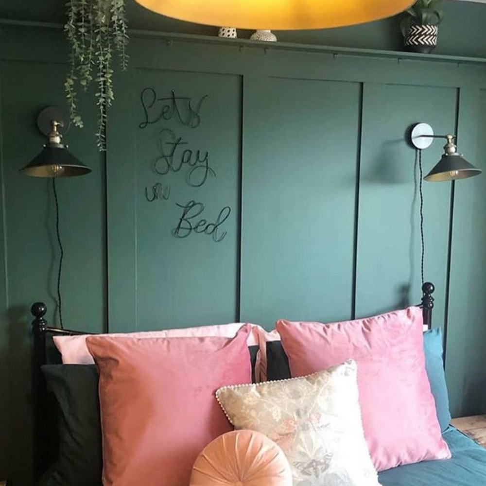
As two very versatile shades, pink and green can be used successfully in both modern and contemporary spaces. Softer tones of pink alongside deep, dark greens can look elegant and sophisticated especially when incorporated with materials such as marble and brass.
The example to left from Instagram account @endofthegrove also demonstrates just how well this palette can work in any room of the home.
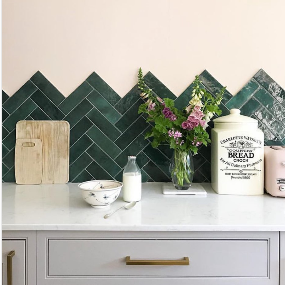
Ottilie, launched in 2020 and is a savoury garden green with a powdery softness which looks great alongside many colours especially blush pinks as shown in the below image to the right. Image credit: @102_thelane

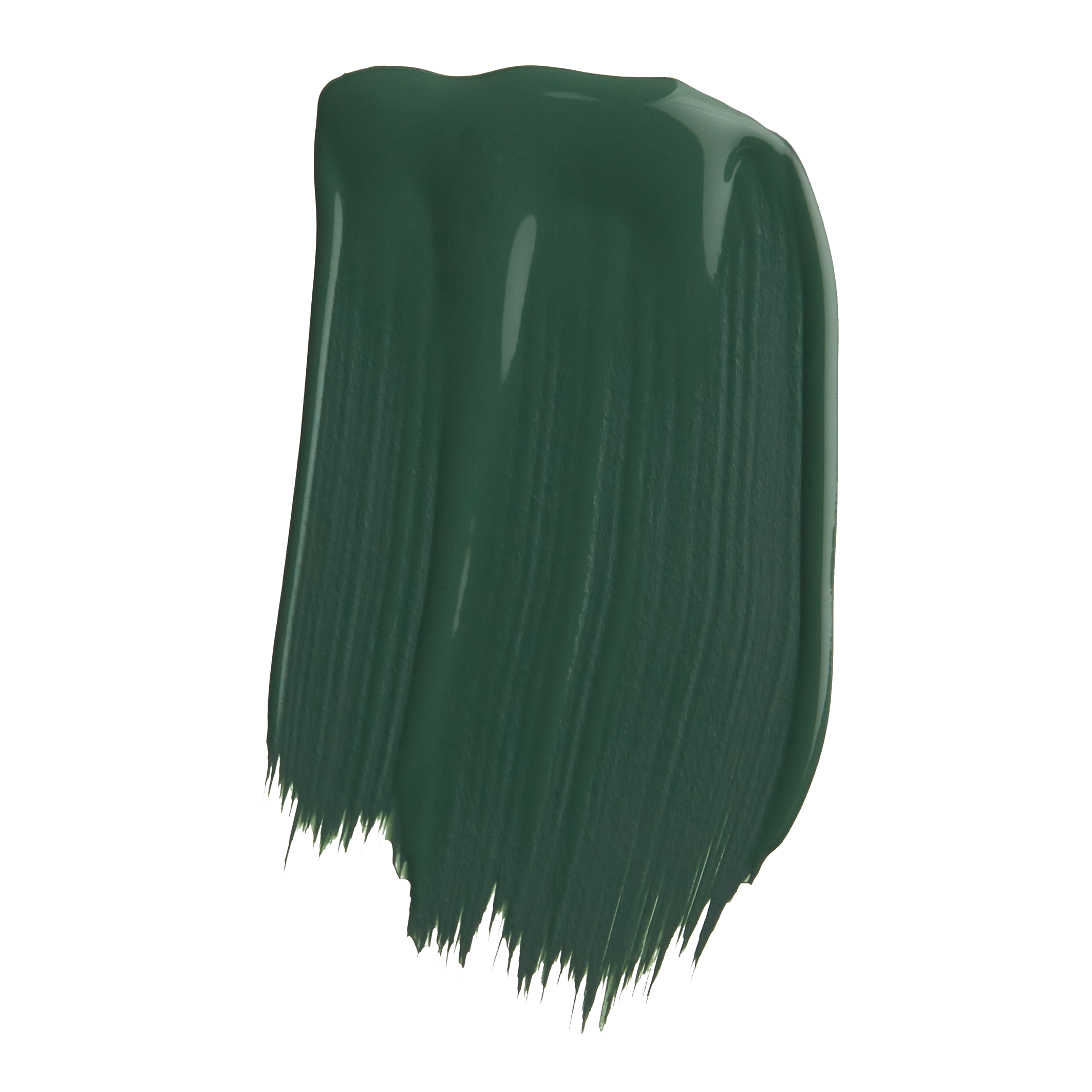
Ottilie
1829 Vintage Collection
Similar stories to explore
- Choosing a selection results in a full page refresh.
- Opens in a new window.
