Spotlight on Design: Harold House
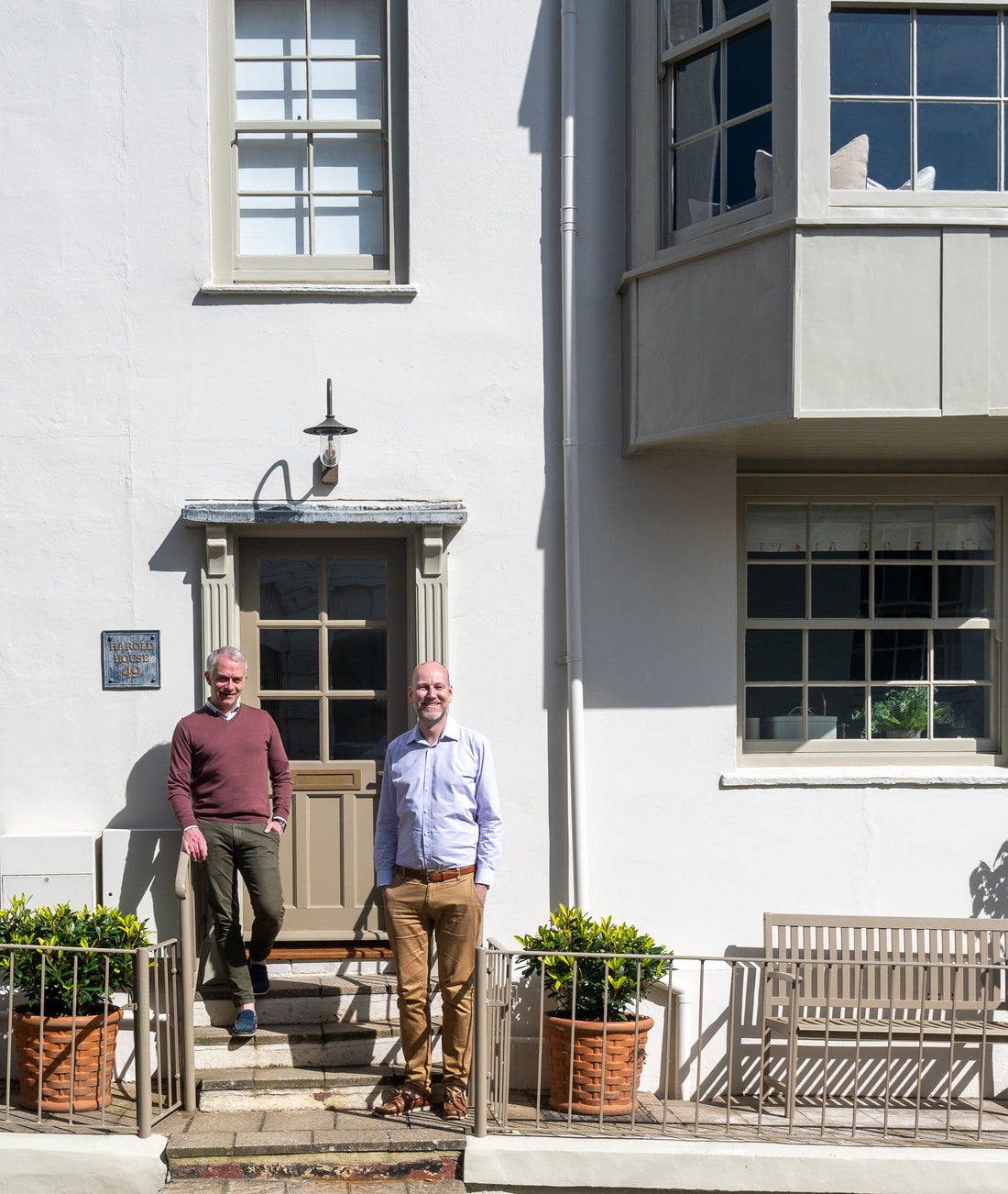
From the hustle of London to the tranquil shores of the Isle of Wight, Marc Thompson and Jack Rebours have meticulously curated a home and a lifestyle store that marries the timeless allure of period properties with island life. We had the privilege of delving into the creative mind behind Harold House, a Georgian townhouse exuding elegance and character, and exploring the intricacies of design philosophy that have shaped Jack Thompson today.
Jun '24
Could you please tell us a little about your background and how they have influenced your current work?
I was born in Brittany and I remember how as a child I was fascinated by some of my relatives who renovated their old farmhouses. I loved the planning and process of modernising an old building ensuring it keeps its integrity, charm and character as all the necessary mod-con were added. That’s when I started to read and collect interior magazines, always drawn to period properties.
My parents lived in a newbuild so I asked my father to line the slopping walls of my bedroom with Tongue and Grove to add character and the furniture was all dark wood labelled then as “English Style”…a sign of the things to come! I have refurbished two properties in London and another one on the island before my most recently completed project Harold House. I have always loved British architecture so remodelling a Georgian townhouse in the old town of Cowes was a dream come true.

What drew you to Cowes and the Isle of Wight, and how has the location influenced your design choices?
My partner and I were working at sea on cruise ships at a time when we wanted to leave our cottage in South-East London for a larger house and being close to the city centre was no longer a necessity. A dear friend of ours was living in Cowes and had invited us for weekends, we remembered how charmed we had been by the place: its busy quaint High Street, the very friendly people, the relaxed holiday feel, all right by the sea. A world away yet so easily accessed from London. That was nine years ago that we took the plunge and never looked back.
The colour of the sea of the Solent, that stretch of water between mainland and the Isle of Wight, is very special to me: it often is a beautiful luminous grey/green throughout the year and this is what drew me the Craig & Rose ‘Coachella’ shade. It works so beautifully when coupled with ‘Lucienne Olive’ reminiscent of the rocks and seaweed found on the beach.
One of my favourite places on the island is Newtown, a tiny old hamlet among a bird reserve on the northern coast of the island, where the sea, meadows and woodland meet. The mix of muted green, brown and blue colours are beautiful and rich.
Could you walk us through your process for creating a cohesive and elegant design for the home, particularly without resorting to seaside cliches?
I still love Tongue and Groove and used it throughout Harold House except in the hallway, stairs and landing to create a contrast, I believe there is an understated cosy sophistication about it that feels relaxed: perfect for a holiday home by the sea and it is particularly pleasing when painted the same colour as the skirting boards, architraves, windows and ceilings.
To create a cohesive feel in a property, I use the same elements from room to room to create a sense of continuity but with slight variations. For example, the same reclaimed wood floor has been used throughout the ground floor: in the kitchen, hallway and dining room. The custom-made timber kitchen I personally designed is the same shaker style as the built-in cupboard doors in the dining room but we chose a different design for the aged brass British-made handles. The bathrooms have the same paint colour, herringbone tiles and curtains but the same taps are in different finish whilst the mirrors, wall lights and wall cabinets are of different designs. The same herringbone wool carpet has been used in the three bedrooms, the vintage furniture and light fittings differ between them.
The overall effect is that you avoid a clashing busy feel that can make a house scheme disjointed with too many details as if you are trying too hard. Instead, it creates a sense of easy flow and calmness even if the rooms are actually densely furnished.
We purposely stayed clear of the white, red and blue colour combo, of any lobster, lighthouse or octopus elements that tend to be too predictable. We opted instead for subtle and limited nudges to the sea: some wall lights are scallop shaped and others actually designed to be used on a yacht. We also have collected antique paintings and vintage prints featuring ships, boats and seascapes.


How did you select your colour palette and, and what drew you to incorporate Craig & Rose into your design scheme?
We like rich muted shades for scheme backgrounds and wanted to use the colours of the seaside landscape near us: the sea, the sand, rocks and vegetation. We also wanted to use a paint brand with a British heritage so when a Scottish friend suggested Craig & Rose, we were immediately drawn to the 1829 Vintage collection. It felt right for a period property by the sea. We selected ‘Coachella’ immediately, for most of the kitchen, and wanted another darker shade that complement it: ‘Lucienne Olive’ was perfect for the island and the ceiling beam. We loved it so much that we used this combo in the dining room, sitting room and two bedrooms.
We used a selection of the Craig & Rose sticky colour patches on a mood board to make decisions about the rest of the house. A paint colour varies so much depending on a room orientation, its floor level, the light of the season etc. But if a selection of colours works on a mood board together, then it will work once painted in the rooms no matter what to create a cohesive and subliminally logical thread throughout the house.
So, to complement ‘Coachella’ and ‘Lucienne Olive’, we selected ‘Parchment’ for the two bathrooms as it is such a warm and sophisticated off-white. Then ‘Olive Laque’ for two bedrooms, working so well with Lucienne Olive too. And finally, for the hallway and stairs: ‘Kashmir Beige’ as a contrast to all the other rooms, working so well with Coachella again on the woodwork.
We are very pleased with the overall colour palette and we often have enquiries about it.


What were the biggest challenges you faced while designing this luxury home, and how did you overcome them?
Harold House is a period Georgian town house that needed complete renovation (rewiring, replumbing etc) and modernisation so the building had to be stripped to the brick, but we wanted to reintroduce the period feel that had been lost over the decades.
To achieve that, we re-introduced all the fireplaces that had been ripped out, found in a local reclamation yard as well as reclaimed a wood floor that we purposely did not sand too much in order to keep the worn and naturally aged look. We designed custom-made shaker wardrobes in all the bedrooms recesses to ensure we made full use of the limited space available as finding the right size and look antiques would have been particularly challenging. We invested in good quality door handles, hinges, light switches and sockets made of brass that oxidized quickly, making them look that they had always been there. We avoided the use of ceiling spotlights and opted for vintage or vintage style wall lights instead. We mixed old and new artwork. We used taps in the kitchen that shows watermarks and new cast iron column radiators with some small imperfections.

All these elements combined with the Craig & Rose 1829 Vintage Collection shades we chose, created an established, grounded and relaxed cosy atmosphere as if the interiors had evolved over a long period of time instead of looking like a newly decorated scheme or like a new build.
How do you balance practicality and functionality with aesthetic considerations when designing a home?
Before designing a home, I start to imagine how each room is going to be used in various occasions.
So, for Harold House which is set up for up to six people, I imagined scenes where two couples with two children would use the property over a weekend staying there, from the moment they reach the front door and enter the house: for example, where do they hang their coats, where do they sit to remove their shoes, where do they switch the light on at night? This led to the creation of a cupboard in the dining room dedicated to coats and shoes as this was not possible in the hallway. I decided then to only have an archway instead of a door between the hallway and the dining room, which led me do the same, opposite, between the hallway and the kitchen: having doors would have made the three rooms feels much smaller and cluttered, removing them created space and it looks really good with custom-made architraves.
I applied this same approach throughout the property.
Another example is that a sitting room always need to accommodate the number of people who can sleep in a house and some guests. So, in Harold House, I designed a custom-made seat in the bay window, and added a seat fender in front of the fireplace: they both look great and enable up to 10 people to comfortably sit without having to move or bring extra furniture into what is a rather humble sized room, with a space to put their drinks at hand.

I was determined to be able to fit a rolltop bath in a specific location of the top floor bathroom: I managed to source the smallest I could find that fit perfectly and it turned out that it is rather comfortable being deeper than most. I also wanted a shower head over it and a shower curtain ring but the ceiling being low, a structure was built in the attic to accommodate their fixing at the right height. The overall result is practical, stylish and very inviting.

So, establishing how each room is going to be used first really helps me decide of the furnishing and its location that will support that, I can then determine precisely where all the radiators, wall lights and ceiling lights, light switches and sockets need to be. Only then do I start to choose what might look good; I tend to have a rather organic approach: ‘I’ll know when I see it’ kind of way. I start the process with one piece in a room such as a rug, or a bed and then build a scheme around it.
What are some of the design elements that are essential to creating a sense of luxury in a home, in your opinion?
Four elements come to mind:
-
Paying attention to the mundane details that your senses pick up: door and cupboard handles that weigh in your hand, heavy doors that feel solid, the clicking sound of a quality tog light switch, the comfort feel of the plushness of goose down pillows and cushion inserts, dimmable wall lights instead of ceiling spotlights, bespoke carpentry and joinery including bespoke architraves and tall skirting boards that really look like they belong to the property rather than an add-on. I have an aversion to windowsills, so I tend to remove them and, instead, I particularly like to frame a sash window like a picture: it really does elevate the look of it.
-
Ensuring room volumes are kept in proportions throughout a property: it is best to have less bedrooms and those you have are large enough to be fully furnished.
-
We love a bathroom TV, that’s a popular feature at Harold House by the bath.
-
Good candles and fresh flowers.
Can you give us a sneak peek into any exciting projects or developments on the horizon or things we should keep an eye out for in the future
Designing our holiday let Harold House, particularly its kitchen was a turning point for us as we developed a great collaboration with our builder and now design kitchens for their clients.
We are about to complete the extensive renovation of a Victorian building on Cowes High street in the same style: a split level two-bedroom apartment with a custom-made kitchen and cabinetry, and a shop on the ground floor where we have opened a lifestyle store called Jack Thompson & Co. selling homeware and gifts as well as offering interior design services, including colour consultation using Craig & Rose paint, reflecting the style of Harold House.
We’ve also established a collaboration with Spence Willard, the leading estate agency on the island that worked closely with us to find the perfect property to renovate. Having seen the ‘before’ renovation, they were quite taken by the ‘after’ and have since asked us to be their in-house interior design services to help their clients.
Finally, we have got on so well with the platform LuxuryCottages.com that we use to rent Harold House, that we have become their ambassadors on the Isle of Wight and we are offering concierge services as well as interior advice to people listing their properties with them.
Shop the story

-

Coachella
1829 Vintage Collection
-
Lucienne Olive
1829 Vintage Collection
-

Parchment
1829 Vintage Collection
-

Olive Laque
1829 Vintage Collection
-

Kashmir Beige
1829 Vintage Collection
Similar stories to explore


- Choosing a selection results in a full page refresh.
- Opens in a new window.